


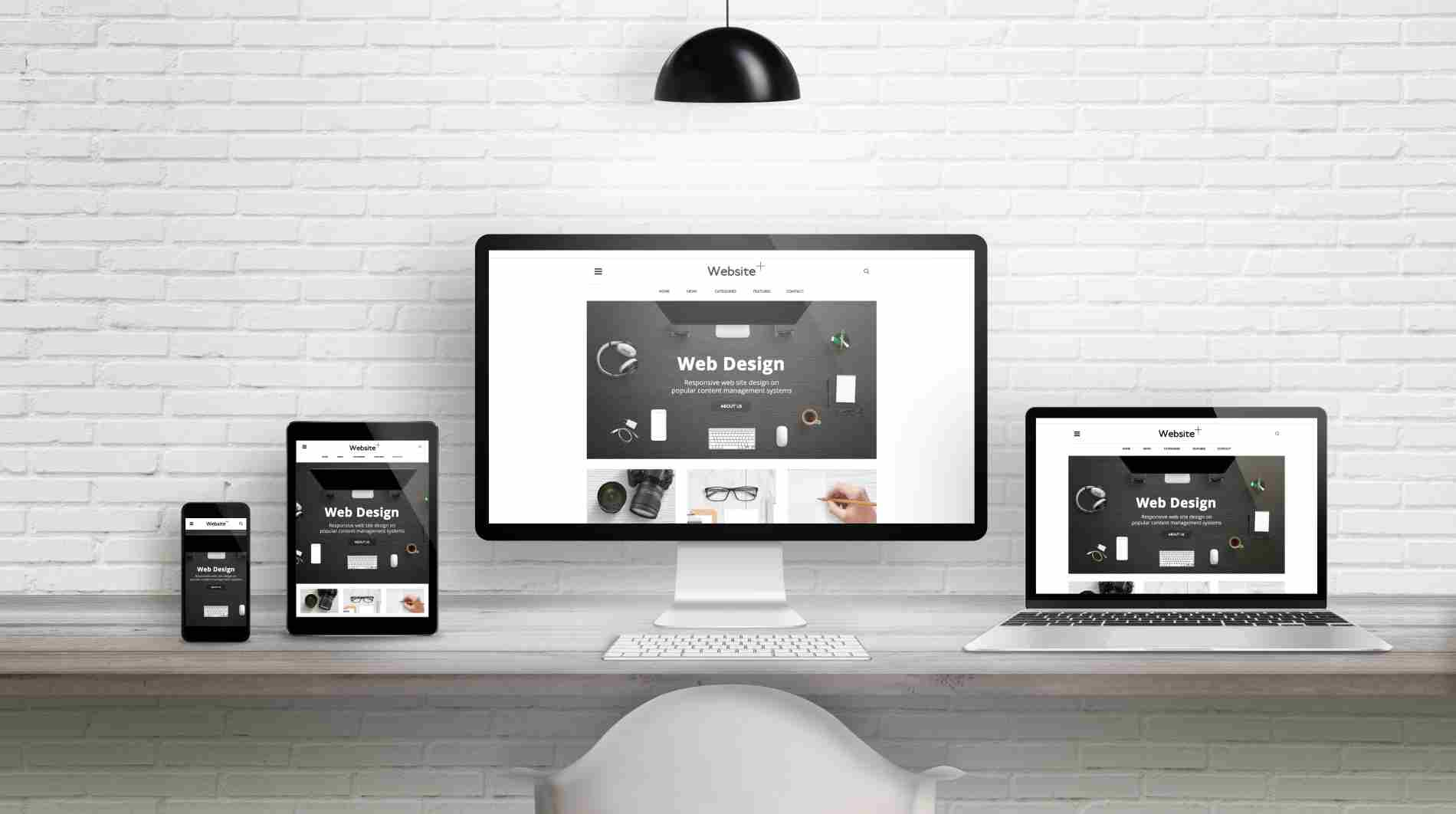
Looking for affordable web hosting in Hong Kong? East Tech Cloud Hosting is a top choice – fast, secure, and reliable. We offer a one-stop service combining web hosting and professional email, providing top-tier technical support at the most affordable prices. It's your premier platform for launching your online business in Hong Kong.