One-page webpage | The difference between one-page websites and multi-page websites


Websites can be categorized into three structural forms: one-page webpages, standalone one-page websites, and multi-page websites. While their names are similar, their concepts and uses differ. A one-page website, also known as a single-page website, is a website design where all content is presented on a single page. Users browsing a one-page webpage do not need to click links to switch pages; instead, they can scroll through all content directly on the same page.
What is a one-page webpage?
A one-page webpage refers to a single page within a website, typically a marketing page for a single theme or event, often used for advertising traffic generation or short-term projects.
It is usually embedded under an existing company website, such as exaxx.com/event2026. It does not have a complete website structure but focuses on a single action goal, such as registration, appointment, or purchase.
These pages typically contain simple brand information, product or event highlights, and a call-to-action (CTA) button. Due to its simple content and clear objective, it is suitable for short-term events or advertising conversions but not for carrying complete corporate information or long-term SEO. 2. What is a One-Page Website?
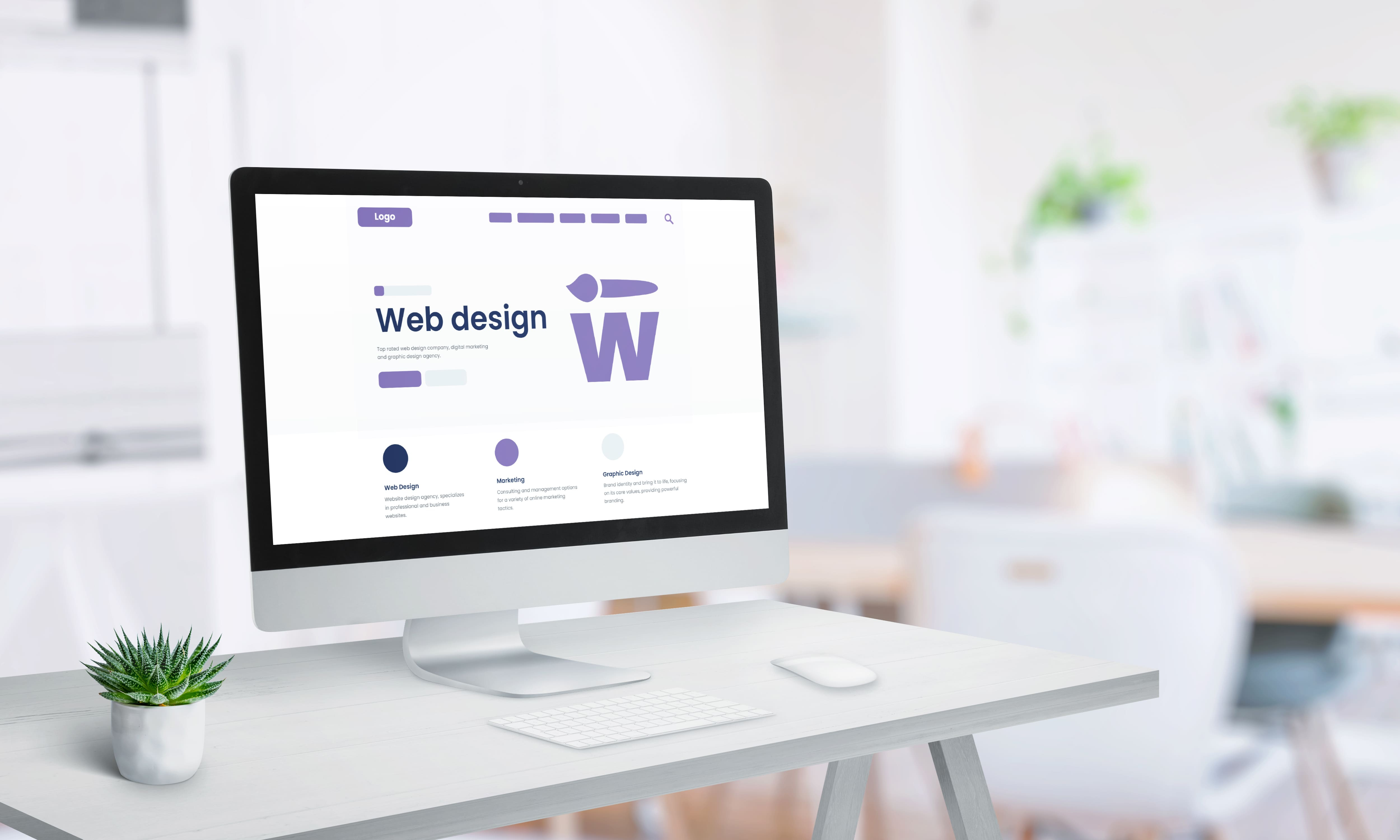
A one-page website is a complete, independent website where all content is concentrated on a single page.
It may have a top navigation bar (such as About, Service, Portfolio, Contact), but clicking on it simply scrolls to that section via anchor points and does not switch to a new page. Content typically includes brand introduction, service features, case studies, contact information, etc., representing a simplified website architecture.
One-page websites are suitable for brands or individuals with limited information and a clear focus, such as freelancer portfolios, small business websites, real estate project introductions, event or exhibition websites, etc.
Its advantages include simple structure, fast development speed, low cost, and suitability for mobile devices. However, its disadvantages include limited SEO visibility, and the potential need to switch to a multi-page website if a large amount of new content is required in the future.
3. What is a Multi-Page Website?
A multi-page website is a traditional and common website architecture, including a homepage, service introduction, case studies, blog, contact us, etc., with each page having its own independent URL and content category. This website structure can hold a large amount of information, allowing users to find the content they need through main menus or internal page navigation. Multi-page websites are particularly suitable for businesses that need to maintain a long-term brand presence, optimize SEO, or have multiple service and product categories.
While its development time is longer and costs are higher, it offers the best scalability. Future content can be continuously added, and new features can be developed, such as membership systems, shopping carts, online appointments, and blog posts. It is suitable for complex projects such as corporate websites, e-commerce platforms, and media websites.
One-Page Website Design Steps
Although the structure of a one-page website is simple, to effectively attract users and improve conversion rates, comprehensive planning and execution are required. The following are the detailed design process and key points:
1. Define Website Objectives (Image, Conversion, Promotion)
Before starting production, the main purpose of the website must be clarified. Different objectives will affect content arrangement, visual design, and subsequent performance tracking methods. Common objectives include:
Brand Image Display
For example, startups and small brands need a simple website to allow visitors to quickly understand the brand positioning, service scope, and contact information.
Lead Generation (Conversion-Oriented)
For example, leading visitors to complete actions such as booking, registering, filling out forms, or making purchases is suitable for advertising-driven traffic.
Event Promotion
For example, product launches, online course enrollments, and limited-time offers aim to get visitors to take action within a short period.
Why is it important?
Without a clear objective, the webpage will be cluttered and the message will be vague. Visitors will not know what the focus is, resulting in a high bounce rate and low conversion rate.
Recommended Practices:
1. Set a single primary goal to avoid pushing too much information simultaneously.
Identify where your visitors are coming from (advertising, SEO, social media) to determine content depth.
Consider the simplest path for users to complete a conversion.
2. Plan the content structure (brand story, product introduction, CTA)
The core of a one-page webpage is a "story-based content flow," guiding visitors step-by-step from top to bottom. It typically includes the following sections:
First Screen Banner (Attracts attention at first glance)
Short title + key value + "Act Now" button
For example: "Limited-time offer | 50% off website design services, book a free consultation now!"
Brand Story or Product Introduction
Let visitors quickly know who you are and what problem you solve.
Present using a "Pain Point → Solution → Benefit" approach.
Service or Product Features
Use bullet points to allow visitors to quickly scan for key points.
Add illustrations and comparison tables to make the advantages more apparent.
Case Studies or Customer Testimonials (Enhancing Trust)
Real-world examples, partner brands Logo & Media Coverage
This section is crucial for building trust.
Pricing Options or Promotional Details
Clearly list the details and duration of the offer to avoid visitor concerns.
Frequently Asked Questions (FAQ)
Answer the most common questions visitors have to answer in advance to reduce bounce rate.
Final Call to Action (CTA)
The CTA must be emphasized again at the end of the page to ensure visitors see the action option at the end.
Suggested Practices:
Content should not be too long, but each paragraph should have a key point.
Include an action button after each section (CTA should be repeated at least 3 times).
Draw a simple "content map" to outline the basic structure before proceeding to the design phase.
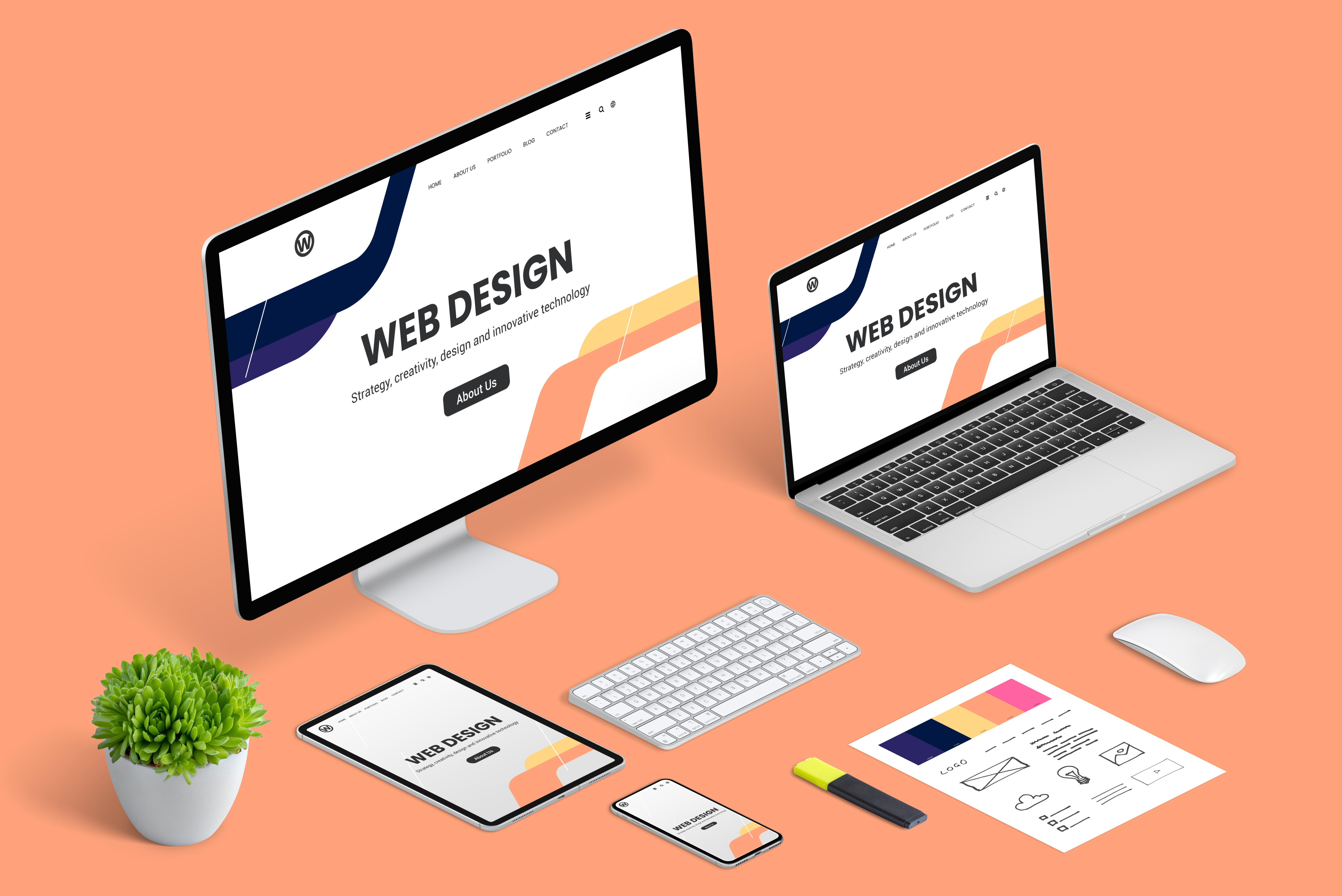
3. Layout and Visual Style Design
One-page websites are vertically oriented; therefore, visual hierarchy and rhythm must be created to prevent visitors from getting bored halfway through.
Design Considerations:
The first screen must have a strong visual focus, paired with an attractive slogan.
Appropriate variation in background color and layout across sections creates a more rhythmic browsing experience.
Maintain consistent color and font to preserve brand recognition.
Use high-quality images or short videos to make the website look more professional.
Use parallax scrolling and animation effects appropriately, but avoid overly elaborate designs that slow down loading times.
Common Mistakes:
Each section looks the same, resulting in a monotonous and disorganized page.
Overly complex visuals obscure the true focus.
4. Create a Responsive Design (RWD)
Currently, over 70% of users browse on mobile devices, so it's crucial to ensure the page displays correctly on various devices.
Mobile Optimization Focus:
Use RWD responsive design to avoid screen tearing on mobile devices.
Text size and button height should be suitable for finger tapping.
Image compression reduces loading time.
Minimize excessive animations or effects to prevent screen lag.
Why is this important?
If the mobile experience is poor, visitors are likely to close the page within 3 seconds, resulting in wasted advertising budget.
5. Incorporate Basic SEO Optimization
While one-page websites aren't ideal for deep SEO, basic optimization is essential to ensure search engines can understand the content and increase exposure.
Basic Optimization Practices:
Include key keywords in the title and meta description.
Use H1, H2, and H3 headings for important paragraphs.
Add alt text to images.
Optimize page load speed to avoid being flagged as a poor user experience by Google.
Use simple URLs, such as example.com/landing-page.
If the goal is a short-term campaign or ad conversion, SEO can be simplified; for long-term exposure, combine with other content marketing strategies or a multi-page website.
6. Testing and Launch
Before launch, multiple tests are necessary to ensure all functions and processes run smoothly:
Testing on different devices (desktop, tablet, mobile)
Forms and CTA buttons function correctly
Anchor navigation redirects correctly
Page load time is within 3 seconds
Tracking codes (Google Analytics, Meta Pixel) are correctly installed
After launch, observe the following data:
Bounce rate, dwell time, scroll depth
CTA click-through rate, form submission rate
Conversion differences between mobile and desktop
Based on the data results, continuously adjust copy, layout, and button positions to gradually improve conversion rates.