


What is RWD? | 3 Key Elements of Responsive Web Design You Must Know

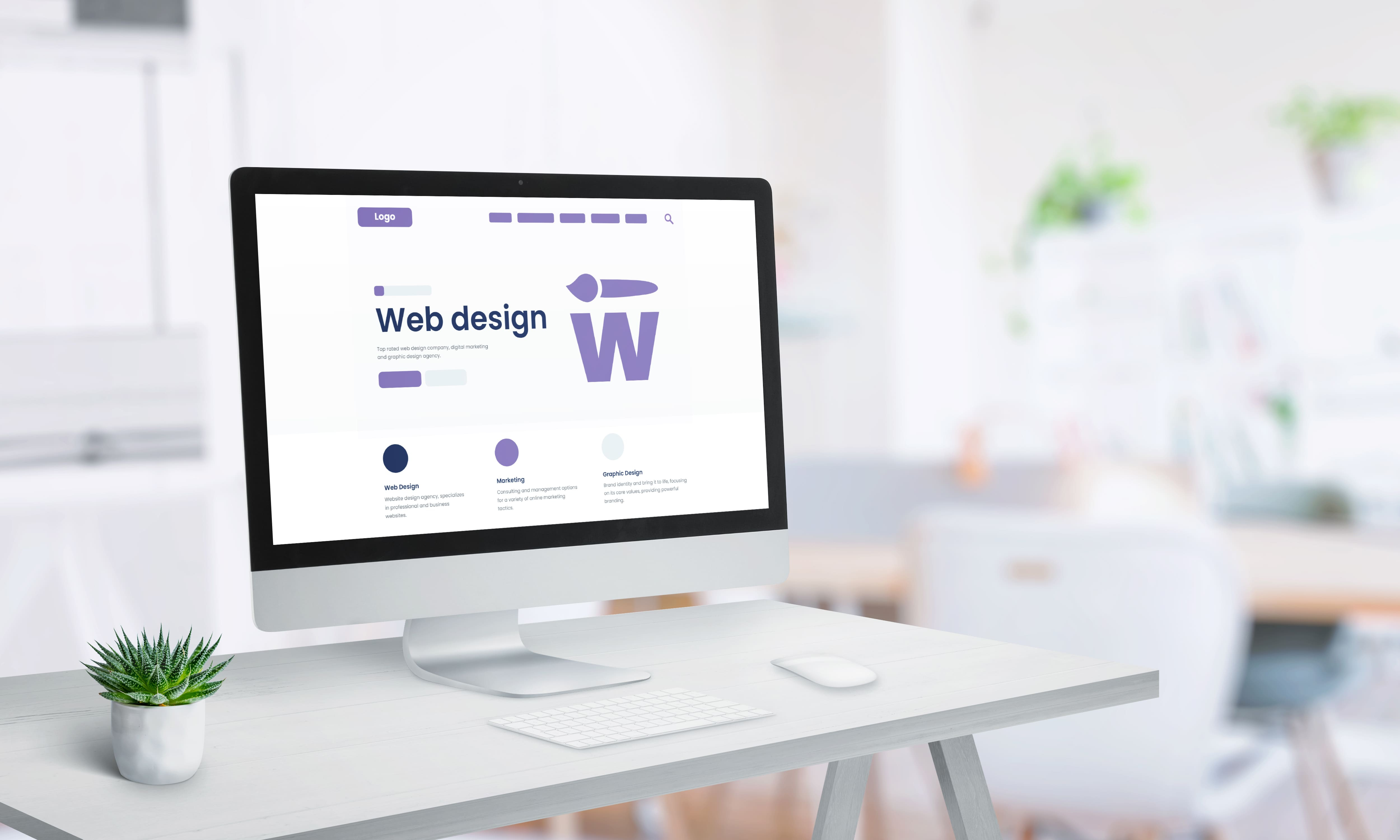
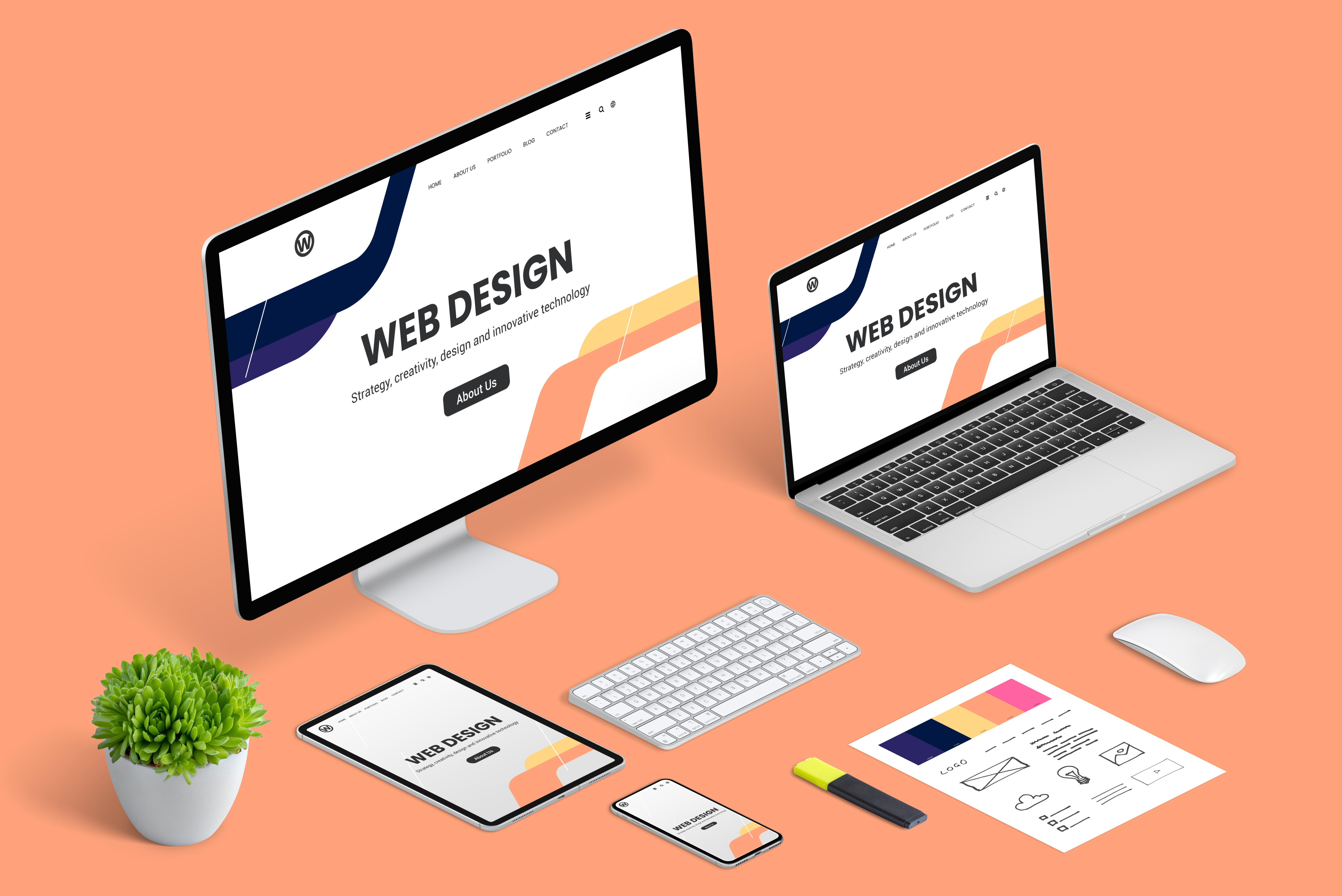
Responsive Web Design(RWD)is a flexible method that enables a single webpage to automatically adjust its layout according to the screen size of the device,whether it's a desktop,tablet,or smartphone.This ensures an optimal user experience regardless of the device being used.In the following sections,we will guide you through the fundamental principles of responsive web design to help you thoroughly understand its core components.
How Responsive Web Design Works
Responsive Web Design(RWD)relies on flexible grid layouts and media query techniques.These technologies enable developers to create designs that can dynamically adjust to meet the needs of various devices.
The business value of applying responsive design cannot be overlooked—it not only increases website traffic but also reduces development and maintenance costs.With a single responsive design,businesses can cover multiple platforms,avoiding the waste of resources that comes with duplicate development.
In summary,responsive design is an indispensable part of modern web design that helps businesses enhance their competitiveness.As technology continues to advance rapidly,the demand for responsive design is growing ever higher,making it an essential tool for successful businesses.
The Importance of Responsive Design
Responsive Web Design(RWD)plays a critical role in modern website development,and its importance cannot be ignored.With the growing popularity of mobile devices,user expectations for websites have risen significantly.Responsive design ensures that a website delivers a consistent and high-quality user experience on any device.
This approach not only enhances user engagement but also improves website accessibility.Users can easily browse content without needing to zoom or scroll horizontally,which greatly increases user satisfaction.
From a business perspective,responsive design can significantly reduce website development and maintenance costs.A single responsive design delivers optimal results across different platforms,saving substantial time and resources.
Furthermore,responsive design helps improve search engine rankings(SEO).Search engines favor websites that provide a good user experience on all devices,giving businesses a competitive advantage in crowded markets.
Overall,responsive design is an essential part of modern web design.Investing in responsive design is not only a strategy to enhance brand image and user experience but also a key safeguard for long-term business success.
As technology continues to evolve,the importance of responsive design will only become more evident.Businesses should adapt in time to maintain their market competitiveness.Future success will belong to those who can respond quickly to change and consistently deliver an outstanding user experience.
The Principles of Responsive Design
The Principles of responsive design emphasize that a website must be capable of adapting to various devices.This design approach involves not only visual adjustments but also functional flexibility.Whether users are on a phone,tablet,or desktop computer,they should enjoy a consistent and smooth user experience.
The core of responsive design are flexible grid layouts and responsive images and media settings.Developers need to ensure that a website automatically adjusts its content arrangement based on different screen sizes,thereby improving browsing convenience and visual appeal.This ensures that users can access all of a website's features without needing to zoom or scroll horizontally.
Businesses should adhere to these principles throughout the design and development process to achieve the best possible user experience.
Fluid Grid Layout
In Responsive Web Design(RWD),fluid grid layout is a key strategy that allows developers to create websites that adapt to multiple devices.This layout method uses percentages instead of fixed units to design web page elements,ensuring excellent display quality across different screen sizes.
With a fluid grid layout,a website's content automatically adjusts to the device's screen size,delivering a seamless user experience.This means users enjoy a consistent browsing experience whether they are on a phone,tablet,or computer.
Fluid grid layout helps improve website accessibility and user satisfaction
When adopting a fluid grid layout,businesses should focus on fine-tuning and optimizing details to meet the needs of different devices.This flexibility not only enhances the user experience but also significantly reduces development and maintenance costs.As an essential part of responsive design,fluid grid layout is a must-have strategy for businesses looking to stay competitive.
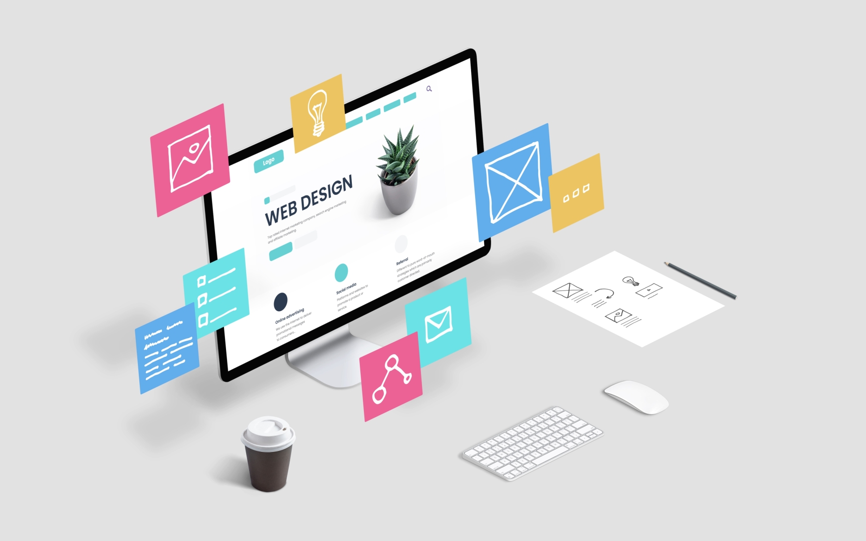
Flexible Images and Media
In responsive design,flexible images and media play a vital role.They ensure that a website's visual elements appear natural and harmonious across different devices.
This strategy ensures that users enjoy a high-quality visual experience no matter what device they are using.
To achieve this goal,developers need to use flexible image sizing and adaptive media queries.This ensures that images and videos automatically adjust to the device's screen size and resolution without affecting the website's loading speed.
By doing so,businesses can improve website loading speed and user satisfaction while reducing server load.Flexible images and media are not just a technical optimization—they are also an integral part of user experience design.By adopting these techniques,businesses can stand out in a competitive digital market,providing users with a high-quality browsing experience anytime,anywhere—thereby increasing brand loyalty and market influence.
Looking for a Professional Responsive Web Design Platform?
If you are looking for a professional responsive web design platform,East Tech may be your best choice!East Tech Responsive Web Design Company creates tailor-made responsive websites for you—custom-built brand website systems with full-device adaptability and responsive experiences.Services include official website development,redesign and upgrades,brand image website planning,integrated UI/UX optimization,and traffic growth solutions.A professional team provides end-to-end support,ensuring secure website operation and doubled conversion rates.
Phone:2331 3344
WhatsApp:94401313